
DIGITAL ILLUSTRATION GALLERY
AT THIS POINT ISSUE #003
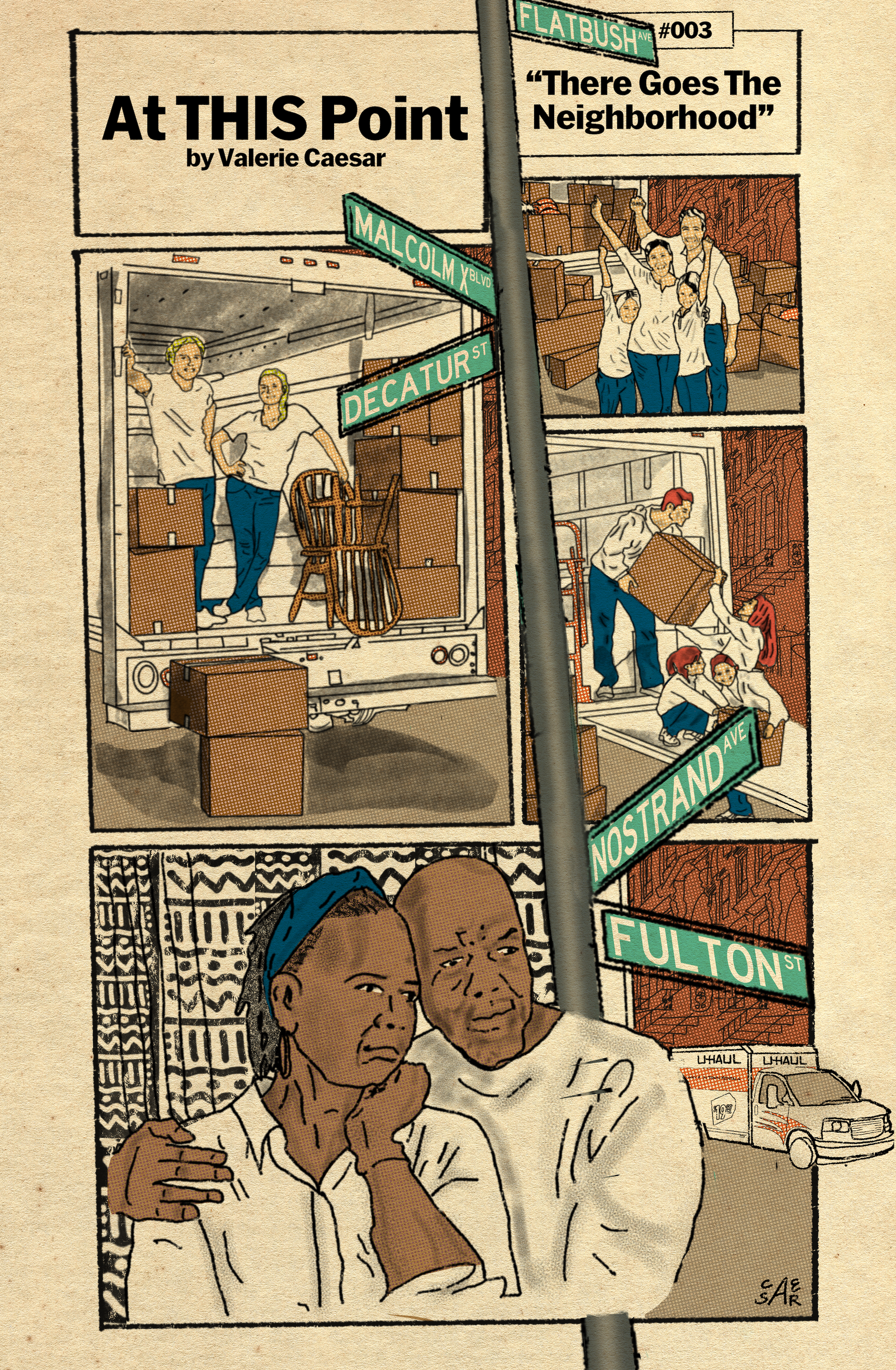
“There Goes The Neighborhood”
“There Goes The Neighborhood,” Issue #003 | At This Point, Valerie Caesar, 2025.
As a Brooklyn native and current resident, the insult and injury of gentrification looms large in my consciousness. Watching new white settlers flood into the communities of my adolescence — strongly Black and Caribbean enclaves that have been oases of culture in a hostile, expensive and ruthlessly capitalistic city — has produced in me a rage and grief difficult to explain calmly and with the scholastic distance required of the victims of colonialism. This first comic on the matter — I have a thousand different stories for the death by a thousand cuts that gentrification precipitates — is a simple, wordless observation of the phenomena.
The scenes depicted in the first three panels might seem innocent, and even worthy of celebration to the viewer unaware of the effects of gentrification of communities of color. It’s the fourth panel that reveals that the events unfolding in those preceding panels may not be so innocuous. It recalls for me a racist video meme I saw recently, where a white girl commented something to the effect of “No one ever complains when white people move into a neighborhood.” The Black folk who found the video and left comments — both academic and scathing — begged to differ.
The presence of the street signs — on a pole, tilted askew, that quite obtrusively divides the very fabric of the comic strip, and certainly is at the center of the lives of the older Black couple — was a last minute addition. For one, I thought the loosely sketched brownstone buildings in the background of each panel was enough to locate the comic strip as occurring somewhere in New York (Brooklyn or Harlem), and although my experience and inspiration derives from Brooklyn, I was satisfied with that perception. My other thought was that gentrification is a global phenomenon and the comic might be more universally understood without locating it particularly.
But then I thought — nah, fcuk that. I’m from Brooklyn. The purpose of creating and sharing this strip is to transmute some of the pain that gentrification has personally caused me, and be a witness for the members of my community that feel this pain, too.
I like how the pole conveys the disruptive energy that these arrivals bring, particularly to the communities noted — if you know, you know. The streets that I chose to display are recognizably Brooklyn thoroughfares,* located in historically Black and Caribbean neighborhoods that have had impact on my life, and that are rapidly gentrifying, resulting in a devastating loss of culture and community. (It was also cool to research things like the font used for the green New York street signs, not to be confused with the newer brown signs you see in some neighborhoods.)
I have so many stories and scenarios and circumstances in my mind that I want to share creatively, and I’m really excited to discover the medium of comic strips as a vessel to contain them. This is particularly the case because of my tendency to reframe things humorously — as well as the fact that I delight in utilizing a format typically used for jokes to deliver ideas of true psychic horror.
This was such a cathartic exercise, and I’m looking forward to using this medium to tell even more Black stories.
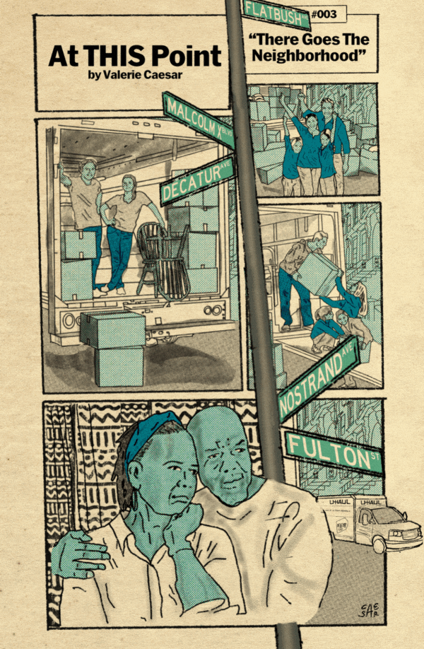
CMYK halftone separations
BEHIND THE SCENES
During the creation process I played with pure halftones, as used in traditional comics, as well as a flat brush color. I ended up with a happy medium of certain elements getting a halftone treatment and others not. I didn’t love how supersaturated the pure halftone pattern made the piece look overall. But I enjoy the color separations when working specifically with CMYK processes, like halftone comic book coloration. I’ve share those separations here as a gif, mostly for the delight of myself. You’ll notice that the street signs and pole don’t shift color. Like I mentioned above, I created it separately as an afterthought and pasted it in, so it didn’t get the CMYK treatment, as I had moved on from it by that point. I might come back to this piece and play with different textures and color approaches. That’s the beauty (and the curse) of digital — it’s never truly done.
*I fucked up and wrote “Decatur Ave” on the street sign — my mind did a mashup of Dekalb Ave and Decatur Street while I was working. I will fix it eventually, and then erase this note like nothing happened.
UPDATE: I fixed it on all published versions except the gif above, but I’ll leave this little video here for posterity.
A CLOSER LOOK

Watch this short video at the full screen setting to view At This Point Issue #003: There Goes The Neighborhood in closer detail.